
challenge
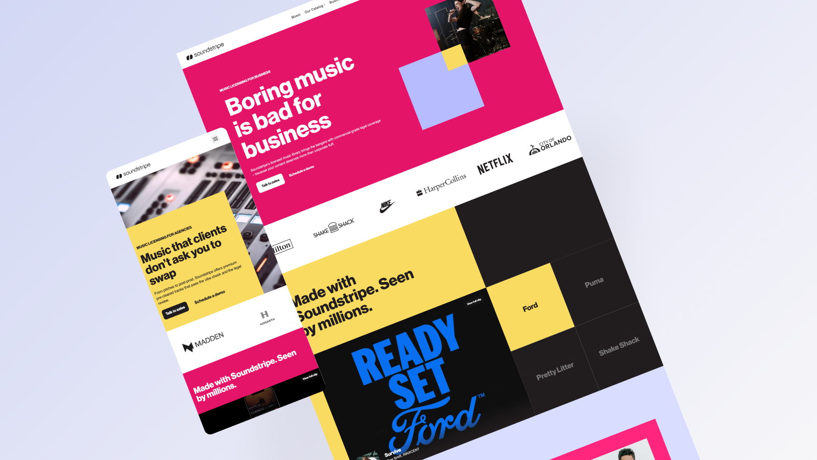
The brand was built for creators, but the business was scaling toward teams and enterprise. User flows weren’t optimized for higher-value buyers, and proof points like case studies and testimonials were limited. The challenge: grow up without growing away.

Strategic insight
The brand needed to mature and appeal to a broader audience. Clarity, earlier trust signals, and stronger outcome-led messaging would likely reduce hesitation and better support higher-value conversions.
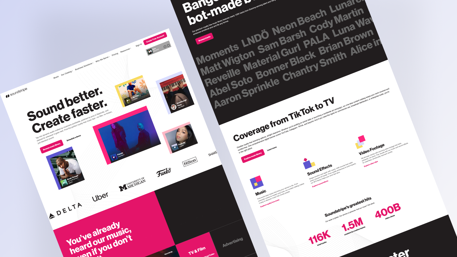
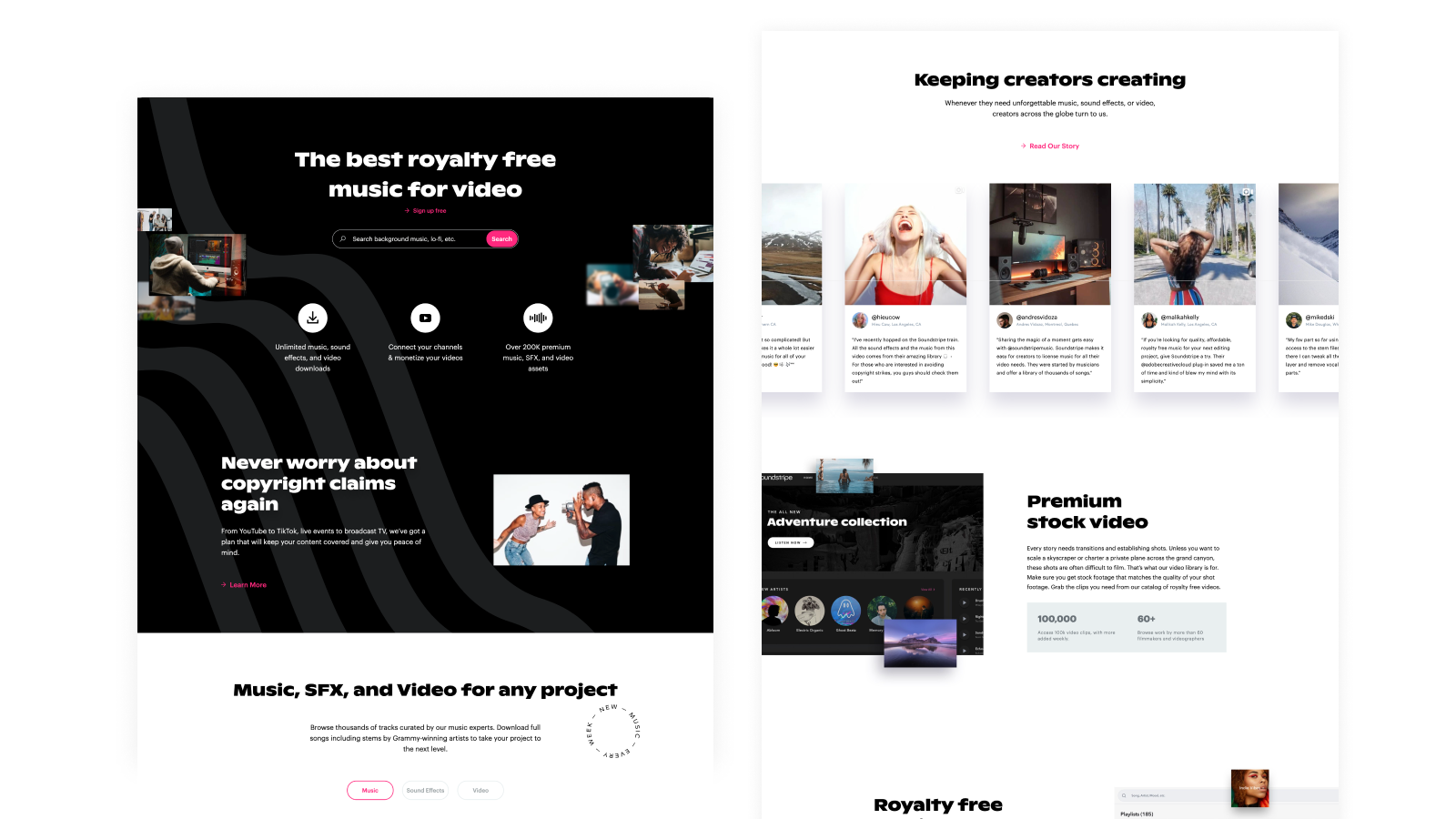
Before a full overhaul, we tested core assumptions on the homepage. Messaging shifted from features to outcomes. Testimonials and case studies were elevated. Navigation was simplified. CTA hierarchy was clarified. Engagement and progression toward pricing were closely monitored to validate what actually reduced friction.
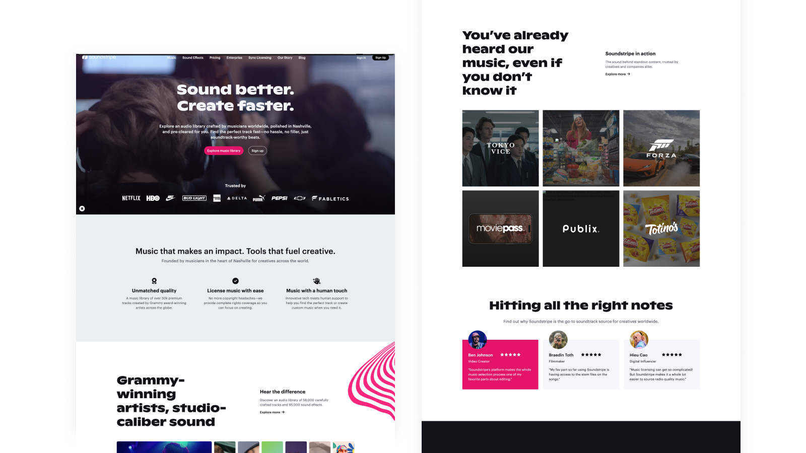
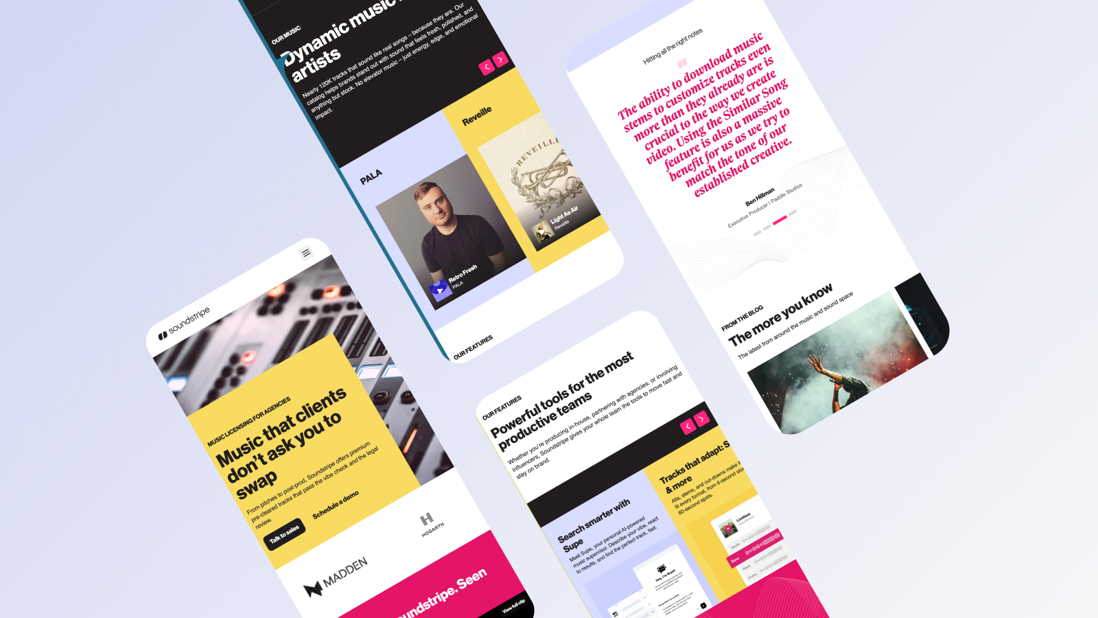
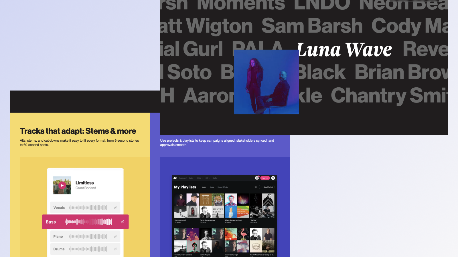
With validated insights, the full site was restructured around user intent and audience segmentation. Typography and visual rhythm were elevated to signal maturity. Case studies and proof were integrated throughout. A modular design system unified marketing and product, making iteration faster and more consistent.

Key Learnings
The result was a more premium, structured experience that supported both creators and teams. Clearer messaging and earlier trust signals strengthened progression toward trial and pricing all within a system designed for ongoing optimization.
Results
Explore some other projects
projects